Unlocking the psychology of colours: How hues impact our mind and our brand perceptions
BRANDINGBEST PRACTICE
3/14/2024
Colour is not just a visual sensation; it's a powerful force that can influence our emotions, behaviours, and perceptions in profound ways. The psychology of colours delves into the complex interplay between hues and human psychology, revealing how different colours evoke specific feelings, associations, and responses. Later on, we'll take a look at how this related to branding, but first let's take a look at the fascinating world of colour psychology and how it shapes our daily experiences.
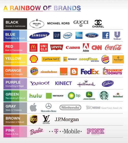
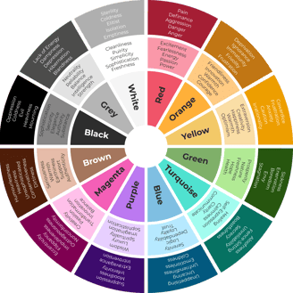
Red
Red is a colour that commands attention and evokes strong emotions. It is associated with passion, energy and excitement, making it a popular choice for brands seeking to stand out and make a bold statement. From Coca-Cola's iconic red branding to the red carpet at prestigious events, this vibrant hue symbolises power, love and vitality.
Blue
Blue is often associated with calmness, serenity, and trustworthiness. It has a soothing effect on the mind and is commonly used in branding to convey reliability and professionalism. From the tranquil waters of the ocean to the calming blue skies, this versatile colour instils a sense of stability and security.
Yellow
Yellow is the colour of sunshine and happiness, evoking feelings of warmth, optimising, and joy. It is often used to grab attention and create a sense of cheerfulness, making it a popular choice of brand in hospitality and food industries. Whether it's the golden arches of McDonald's or the bright packaging of Coco Pops, yellow exudes positivity and optimism.
Green
Green is the colour of nature and represents growth, harmony, and balance. It is associated with health, wealth, and environmental sustainability, making it a popular choice for brands in the wellness, finance, and eco-friendly sectors. From the lush greenery of outdoor landscapes to the organic packaging of natural products, green signifies renewal and environmentalism.
Purple
Purple is the colour of royalty, luxury, and spirituality. It combines the stability of blue with the energy of red, creating a sense of mystery and sophistication. From the regal purple robes of monarchs to the luxurious packaging of high-end cosmetics, purple conveys elegance and opulence.
Orange
Orange is the colour of energy, enthusiasm, and creativity. It stimulates the appetite and is often used in branding for food and beverage products. From the vibrant orange hues of autumn leaves to the playful packaging of children's toys, orange exudes warmth and excitement.
The psychology of colours offers valuable insights into the way different hues impact our thoughts, feelings, and behaviours. Whether it's the fiery passion of red, the calming serenity of blue, or the vibrant energy of yellow, each colour has its own unique psychological effects. By understanding the psychology of colours, brands can strategically use colour to evoke specific emotions, create experiences, and connect with their audience on a deeper level.
Colour is a powerful tool in the world of visual branding and graphic design, capable of evoking emotions, shaping perceptions, and influencing consumer behaviour in profound ways. From the vibrant red of Coca-Cola to the calming blue of Facebook, brands strategically leverage colour to convey their personality, connect with their audience, and differentiate themselves in a crowded marketplace. But what exactly is the psychology behind colour, and how does it impact our perceptions and interactions with brands? Let's delve into the fascinating world of colour psychology in visual branding and graphic design.
The power of colour associations
Colours are deeply ingrained in our cultural and societal norma, and they often carry specific associations and meanings. For example, red is commonly associated with passion, excitement, and energy, while blue is associated with trust, reliability, and professionalism. These colour associations can vary across different cultures and contexts, but they play a crucial role in shaping how we perceive and interpret visual stimuli.
The influence of colour on brand perceptions
In the world of branding, colour plays a pivotal role in shaping the perception of a brand and its values. A brand's colour palette can communicate its personality, values, and positioning in the market. For example, luxury brands often use sophisticated colours like black, gold and silver to convey exclusivity and elegance, while eco-friendly brands may use shades of green to symbolise sustainability and environmental consciousness.
Creating emotional connections
Colours have the power to evoke strong emotional responses, which can be leveraged by brands to create memorable and impactful visual experiences. Warm colours like red, orange and yellow tend to evoke feelings of warmth, while cool colours like blue and green evoke feelings of calmness, serenity and trust. By carefully selecting colours that resonate with their target audience, brands can create emotional connections and foster positive associations with their products and services.
The role of colour in user experience design
In addition of branding, colour plays a crucial role in user experience (UX) design, influencing how users interact with digital interfaces and products. Designers use colour to guide users' attention, communicate hierarchy and structure, and create visual harmony and balance. For example, call-to-action buttons are often designed in contrasting colours to stand out and prompt user interaction, while muted background colours create a calm and distraction-free browsing experience.
Cultural considerations
It's essential to consider cultural differences and preferences when using colour in branding and design. Certain colours may carry different meanings or associations in different cultures, and what resonates with one audience may not necessarily resonate with another. Brands operating in global markets must carefully consider nuances and adapt their colour choices accordingly to ensure their messaging is culturally sensitive and inclusive.
Colour psychology plays a significant role in visual branding and graphic design, influencing how we perceive and interact with brands on a subconscious level. By understanding the psychology impact of different colours and their associations, designers and marketers can strategically use colour to convey messaging, create emotional connections, and shape customer perceptions in meaningful ways. Whether it's evoking excitement with vibrant reds or fostering trust with calming blues, the power of colour in visual branding and graphic design is undeniable.
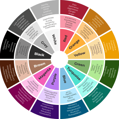
So, let's take a look at some of the most popular colours and see what emotions they generally evoke (in a western culture)...